


From Our Hearts to Your Hands
Delicious almonds from passionate growers.
Keep up with Blue Diamond
Sign up for 15% off in the Blue Diamond Almonds Nut & Gift Shop.
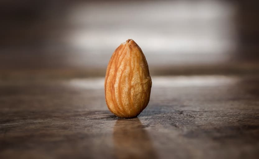
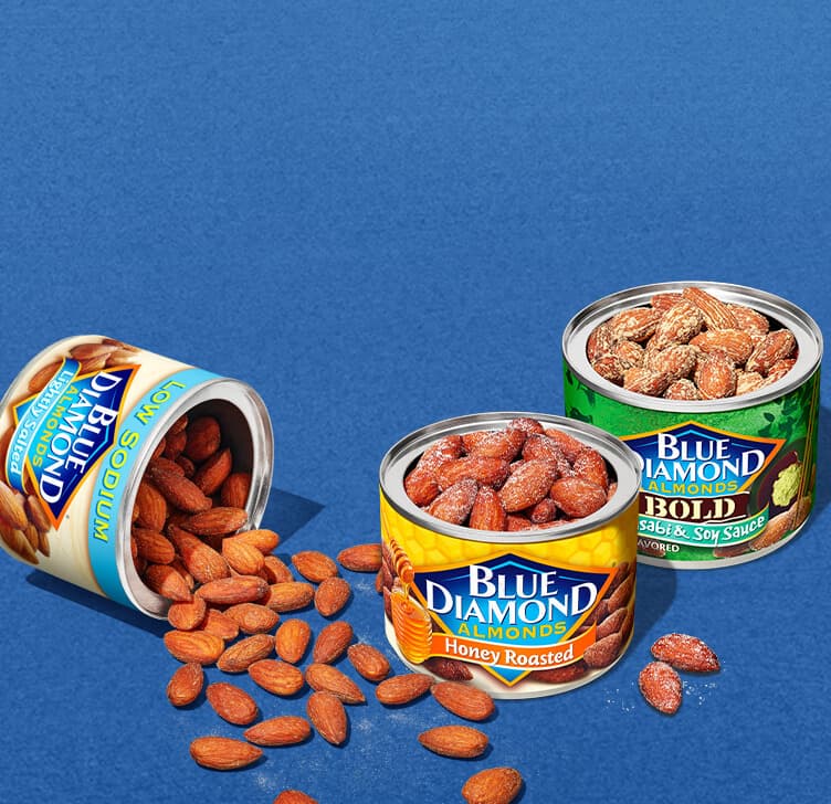
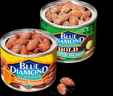
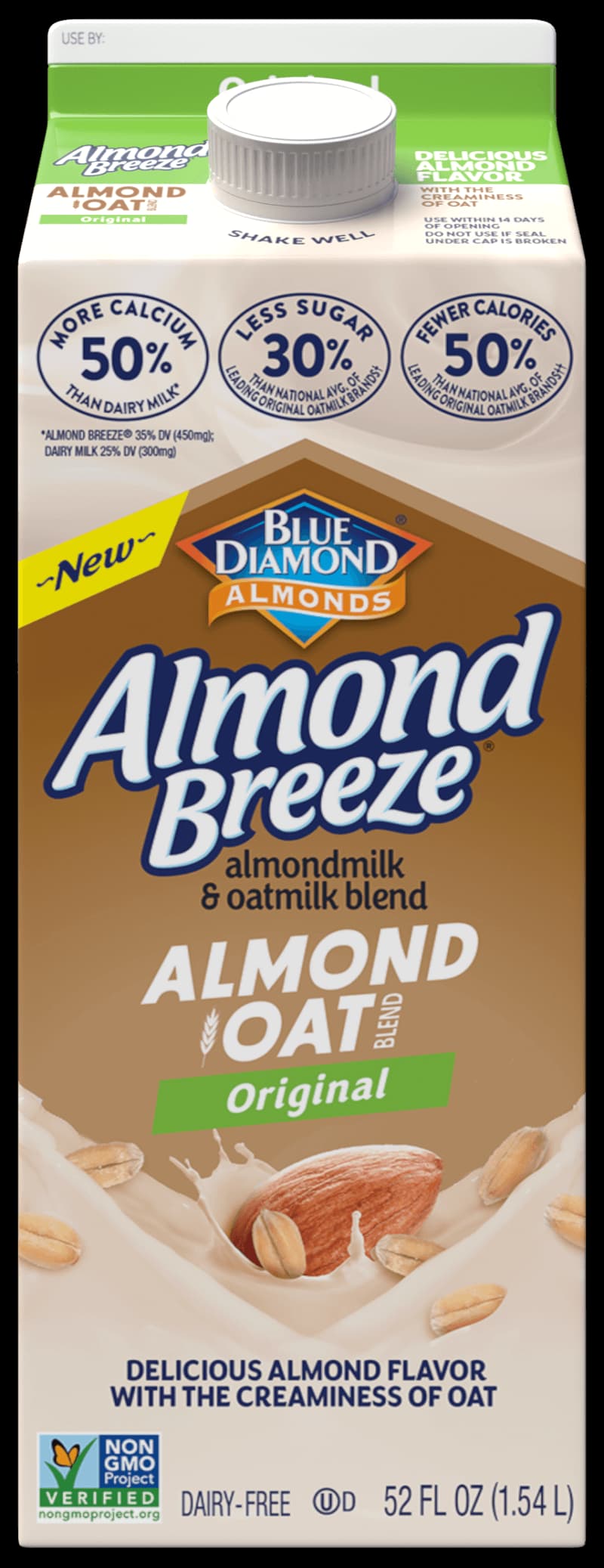
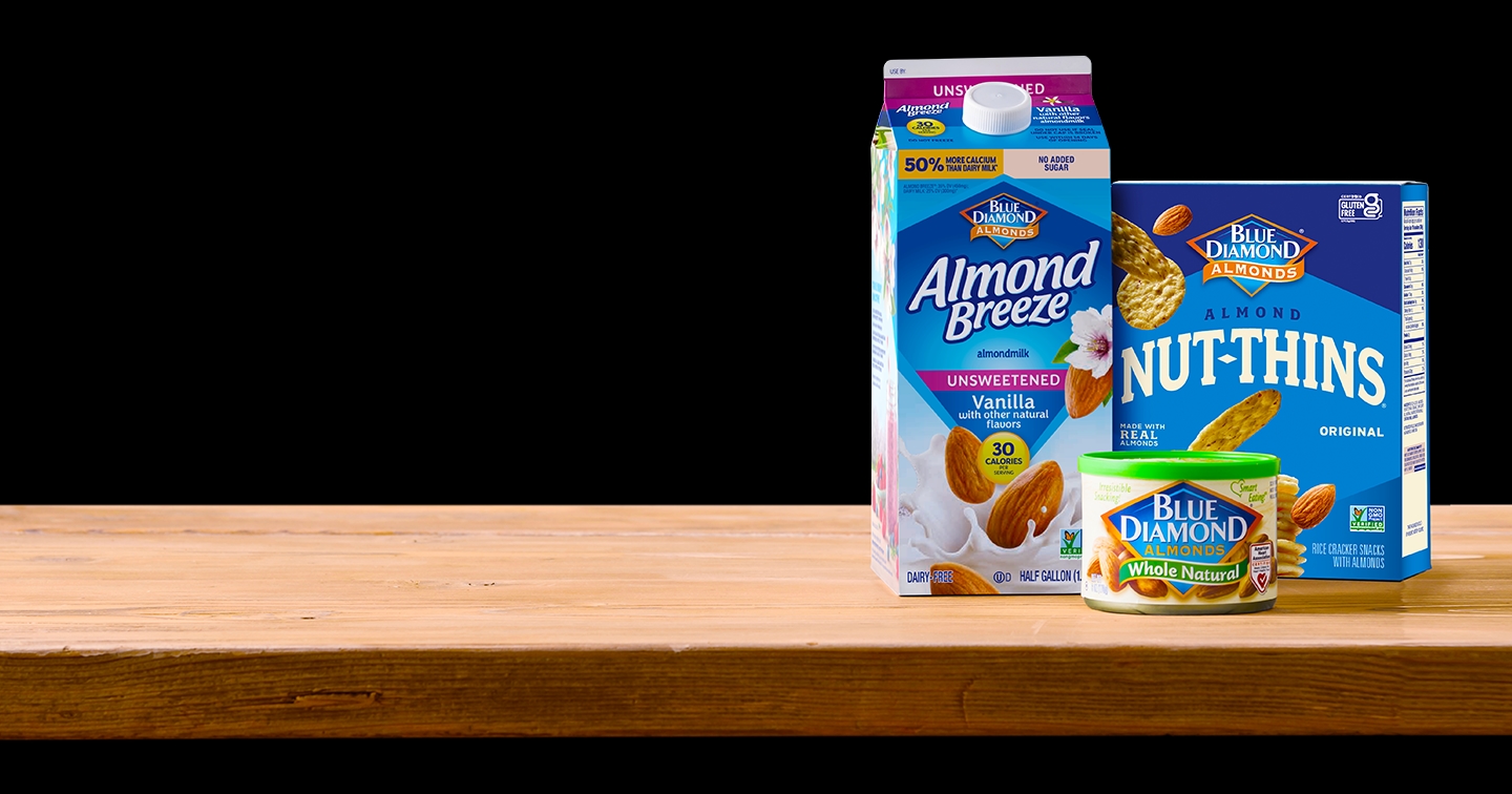
Almonds Are All We Do
All our time and energy goes into creating the highest quality almond products in all kinds of tasty shapes and forms.
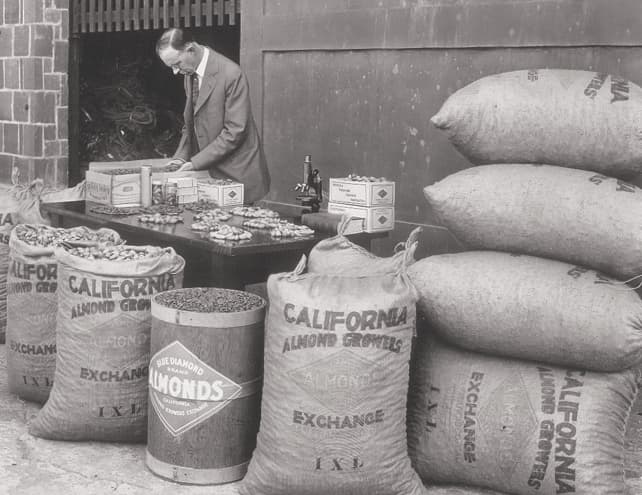
Perfected Over Generations
We’ve been at the forefront of almond innovation for more than 100 years.


Quality is Our Legacy
We work with a passionate family of growers to bring you the most delicious, highest quality almonds.